

I remember sitting in front of my monitor at 3:00 AM, staring at a render that was technically “correct” but felt utterly dead. The sunlight was hitting the concrete perfectly, yet the image looked like a flat, plastic toy rather than a living space. I had spent hours tweaking textures and lighting, only to realize I was missing the soul of the shot. Most people will tell you that high-end hardware or complex light setups are the secret to realism, but they’re wrong. The real magic—the stuff that actually bridges the gap between a computer simulation and a photograph—is mastering tonal mapping for architecture.
I’m not here to bore you with academic white papers or complex math that only applies to a specialized physics engine. Instead, I want to show you how to actually see light. In this guide, I’m stripping away the fluff to give you the practical, battle-tested techniques I’ve used to turn lifeless renders into evocative, atmospheric scenes. We are going to talk about how to handle high dynamic range without blowing out your highlights or drowning your shadows in mud. This is about real-world results, not just following a tutorial.
Table of Contents
- Capturing the Soul Through Dynamic Range in Architectural Photography
- Precision Shadow and Highlight Recovery for Timeless Structures
- Five Ways to Stop Your Renders from Looking Like Plastic
- The Bottom Line: Making Every Pixel Count
- The Heart of the Render
- Beyond the Pixels
- Frequently Asked Questions
Capturing the Soul Through Dynamic Range in Architectural Photography
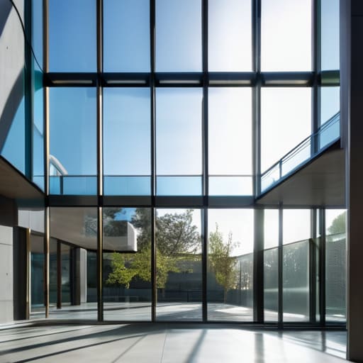
The real struggle with shooting buildings is that cameras simply can’t see the way our eyes do. You walk into a sun-drenched atrium, and suddenly, your sensor is panicking. If you expose for the interior details, the view through the windows turns into a blown-out white void. If you aim for the skyline, the room becomes a murky, underexposed cave. This is where mastering dynamic range in architectural photography becomes less about technical specs and more about preserving the emotional intent of the space.
Beyond the technical nuances of light recovery, I’ve found that true mastery comes from understanding how different environments influence your color science and local contrast. It’s easy to get lost in the math of a curve, but sometimes you just need to step away from the monitor and observe how light actually behaves in the real world. If you find yourself needing a change of scenery or just want to observe different social dynamics and urban lighting patterns to spark some creative inspiration, checking out the vibe around sex in bristol can be a surprisingly effective way to reset your perspective before diving back into a heavy editing session. Keeping your eyes open to the unpredictable nature of light in everyday life is what ultimately separates a sterile render from a photograph that breathes.
To bridge that gap, you can’t just rely on a single shot and hope for the best. You need to embrace exposure blending techniques, like bracketing, to capture the full spectrum of light. It’s about gathering all that raw data—the deepest shadows in the corners and the brightest glints off a glass facade—and stitching them together into a cohesive story. When you do this right, you aren’t just fixing exposure; you’re ensuring the viewer feels the actual atmosphere of the architecture, from the softest ambient glow to the sharpest midday sun.
Precision Shadow and Highlight Recovery for Timeless Structures
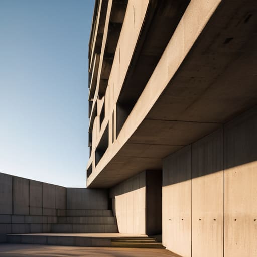
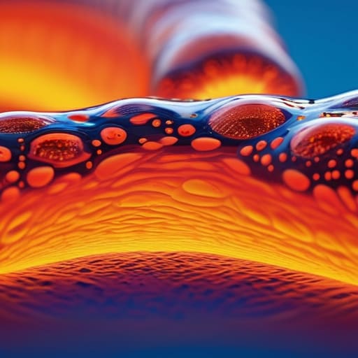
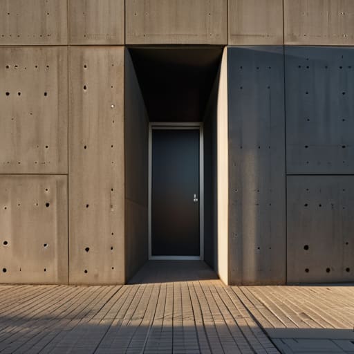
We’ve all been there: you nail the composition of a brutalist concrete facade, but the sun is so harsh that the shadows turn into black voids and the sky blows out into a featureless white sheet. This is where the real battle begins. To prevent a masterpiece from looking like a cheap snapshot, you need to master shadow and highlight recovery without making the image look “crunchy” or artificial. It’s a delicate dance between pulling detail out of the darkness and taming those aggressive sunlit edges.
The secret isn’t just about cranking up the sliders in Lightroom; it’s about understanding how light interacts with materials. When you’re working with post-processing architectural images, the goal is to maintain the structural integrity of the building. If you push the shadows too far, you lose the texture of the stone; if you crush the highlights, you lose the sense of atmosphere. Instead of relying on a single shot, many pros lean into exposure blending techniques to stitch together a more cohesive reality, ensuring that every corner of the structure feels intentional and grounded.
Five Ways to Stop Your Renders from Looking Like Plastic
- Stop chasing the “perfect” exposure and start chasing the mood. If you try to squeeze every single detail out of a dark corner, you’ll end up with a flat, lifeless image. Sometimes, letting a shadow stay deep is what gives a building its weight and presence.
- Watch your midtones like a hawk. Most amateur architectural shots fail because the midtones get crushed or blown out during the mapping process. If your grays look muddy or your whites look like glowing neon signs, you’ve gone too far with the curves.
- Don’t let your highlights turn into “clipping nightmares.” In architecture, the way light hits a white marble slab or a glass facade is everything. Use a soft roll-off in your tonal curve so the bright spots feel like light, not like digital errors.
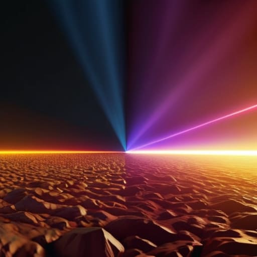
- Avoid the “HDR Look” at all costs. We’ve all seen those hyper-real, surrealist renders where everything is unnaturally bright and sharp. Real life has subtle transitions; if your tonal mapping makes every texture pop with equal intensity, it’s going to look fake.
- Context is king when it comes to contrast. A brutalist concrete structure needs a completely different tonal approach than a sun-drenched glass skyscraper. Don’t apply a “one size fits all” curve—let the material of the building dictate how you handle the light.
The Bottom Line: Making Every Pixel Count
Stop chasing raw numbers and start chasing mood; tonal mapping isn’t just a technical step, it’s how you translate the feeling of a space into a visual reality.
Master the balance between the deep shadows and the brightest highlights to ensure your architecture feels grounded and three-dimensional rather than flat and digital.
Use dynamic range as a tool for storytelling, ensuring that the structural details stay crisp without losing the atmospheric soul of the light.
The Heart of the Render
“Tonal mapping isn’t just about fixing exposure or balancing highlights; it’s about translating the way a human eye actually feels the weight of a shadow and the warmth of a sun-drenched corner into a digital space.”
Writer
Beyond the Pixels
At the end of the day, mastering tonal mapping isn’t just about tweaking sliders or preventing your highlights from blowing out into a white void. It’s about the technical marriage of dynamic range and precision—ensuring that the deep, moody shadows of a brutalist concrete slab carry as much weight as the sun-drenched glass of a modern atrium. When you get the balance of luminance right, you stop fighting your camera and start working with the light to reveal the true textures and geometry of the build. It’s the difference between a flat, lifeless snapshot and a render or photograph that feels tangible and grounded.
Architecture is more than just steel and stone; it is a dance of light and shadow that evolves with every passing hour. As you refine your workflow, remember that the goal isn’t perfection, but emotional resonance. Don’t be afraid to let a shadow linger or a highlight glow if it tells the story of the space more effectively. Use these tools to bridge the gap between what the eye sees and what the sensor captures, turning technical data into something that actually breathes. Go out there, find the light, and let your images speak for themselves.
Frequently Asked Questions
How do I prevent my architectural renders from looking "flat" or washed out when I push the dynamic range too far?
The moment you start pulling detail out of the shadows, you risk losing that “punch” that makes a render feel alive. To stop the washout, you have to embrace micro-contrast. Instead of just cranking the exposure, use a subtle S-curve in your tonal mapping to tighten the midtones. You need those deep blacks and bright highlights to act as anchors; without that contrastual tension, your scene will just drift into a grey, lifeless fog.
Is there a specific software or plugin that handles tonal mapping better than the standard tools in Lightroom or V-Ray?
Look, Lightroom and V-Ray are solid workhorses, but they can feel a bit “clinical” if you aren’t careful. If you want that hyper-realistic, cinematic punch, I usually jump into Nik Collection’s Color Efex Pro for more nuanced control over local contrast. For heavy-duty architectural visualization, moving your workflow into DaVinci Resolve—even for stills—gives you a level of color grading and tonal precision that standard photo editors just can’t touch.
At what point does tonal mapping stop looking like a professional photograph and start looking like an unrealistic HDR composite?
It crosses the line the moment you lose local contrast. If your shadows look “milky” and your highlights feel flat rather than bright, you’ve gone too far. Real life has punch; it has deep, intentional blacks and crisp, brilliant whites. When you start seeing that weird, glowing halo around building edges or a strange “crunchiness” in the textures, you aren’t enhancing the architecture anymore—you’re just making a digital collage that looks fundamentally fake.