


I still remember the night we were polishing the onboarding flow for a music‑streaming startup. The screen was clean, the colors were on point, but something felt flat—until I walked into the office kitchen, turned on the espresso machine, and let the hiss of steam cut through the silence. That tiny auditory cue instantly focused the team, and when we layered a subtle click on the ‘Play’ button, users later told us the app ‘came alive’. That was my first real lesson in the power of Sensory hierarchy in UX, and it taught me that sight alone rarely does the heavy lifting.
From that moment on I stopped writing endless style guides about pixel‑perfect grids and started treating each sense like a teammate with a clear role. In this post I’ll strip away the buzzwords and walk you through three concrete ways to let vision, sound, and even haptic feedback play together without overcomplicating the design. Expect a no‑fluff, experience‑tested checklist you can drop into any project tomorrow—because a good sensory hierarchy should feel obvious, not intimidating. You’ll see why it works for dashboards and games alike.
Table of Contents
- Sensory Hierarchy in Ux Orchestrating Multisensory Design
- Balancing Audio Visual Elements for Cognitive Ease
- Prioritizing Haptic Feedback to Elevate Interaction
- Managing Sensory Load a Guide to Weighting Models
- Cross Modal Perception Strategies for Seamless Interfaces
- Implementing Multisensory Design Principles Without Overwhelm
- 5 Sensory Secrets to Crafting Intuitive Experiences
- Quick Wins for Sensory‑Smart UX
- The Sensory Ladder
- Wrapping It All Up
- Frequently Asked Questions
Sensory Hierarchy in Ux Orchestrating Multisensory Design

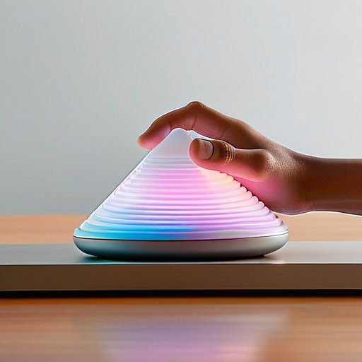
When I sketch a new onboarding flow, I start by mapping out which sense should lead the conversation. Visual cues—color shifts, micro‑animations—grab attention first, but I quickly ask myself how much extra information the eye can safely process before the user feels overwhelmed. That’s where sensory load management steps in: I deliberately throttle the visual density and reserve space for subtle haptic pulses that confirm a tap. By aligning the design with cross‑modal perception in design, the brain stitches together what it sees and feels, turning a simple form into a coherent, low‑friction experience.
The next layer is the audio‑visual balance in user interfaces. A gentle click or a soft vibration can cue the next step without stealing focus from the primary visual task. I often prototype with a lightweight sound library, then test whether the auditory cue feels like a helpful nudge or a noisy distraction. When the timing feels right, I document the relationship in a UX sensory weighting model, assigning percentages to sight, sound, and touch. That model becomes a checklist for future projects, ensuring that each new feature respects the hierarchy while still feeling delightfully tactile.
Balancing Audio Visual Elements for Cognitive Ease
When I sketch a dashboard, I start by mapping out the visual flow first—where the eye naturally lands, what draws attention, and where I can afford a brief pause. Once that scaffold is solid, I sprinkle in audio cues that confirm an action without stealing focus. A gentle click or a soft chime, timed just after the visual cue, creates a visual rhythm that guides the brain rather than bombarding it.
When you start mapping out a multisensory prototype, it’s surprisingly useful to see how another team tackled the same challenge—especially one that had to juggle visual cues, subtle auditory prompts, and tactile confirmations without overwhelming the user. I recently stumbled upon a concise field guide that walks you through a step‑by‑step workflow, complete with downloadable templates and a short video walkthrough; you can grab it at cairns sex. The real gem of the resource is the “Sensory Weighting Checklist,” which helped my team quickly decide when to lean into haptic feedback versus a soft chime, keeping the overall experience intuitive and delightfully crisp.
The trick is to treat sound like a subtle scaffolding rather than a constant soundtrack. I give users a moment to process the visual information, then slip in a low‑frequency tone that signals “next step” without demanding attention. By keeping the sound within an auditory buffer—just long enough to be noticed but short enough to fade—the interface feels responsive and, more importantly, cognitively gentle. The result? A smoother mental glide through each task.
Prioritizing Haptic Feedback to Elevate Interaction
When I sketch a new onboarding flow, the first thing I ask myself is: what will the user actually feel? A gentle vibration as a button snaps into place signals success before the eyes can even register it. By foregrounding tactile cues early in the interaction chain, I give the brain a concrete reference point, which reduces cognitive load and makes the whole experience feel more grounded.
In practice, I keep the haptic palette lean—just a click, a pulse, or a soft thud—so each sensation carries weight. When a user drags a slider, a subtle physical resonance at the endpoint tells them they’ve hit the sweet spot, even if they’re looking away. This intentional restraint prevents vibration fatigue and lets the tactile layer act as a silent guide, reinforcing visual cues without overwhelming the user.
Managing Sensory Load a Guide to Weighting Models
When a screen bursts with motion, a chime rings, and a vibration buzzes, the brain faces a rapid cross‑modal negotiation. Managing that sensory load starts with a simple ledger: assign each channel a weight based on its cognitive cost and relevance to the task. In practice, a designer might give visual cues a 0.5 coefficient, audio 0.3, and haptic 0.2, then sum the values to keep the total under a preset threshold. This audio‑visual balance in user interfaces ensures no single sense drowns out the others, preserving clarity while still leveraging multisensory design principles.
Once the coefficients are set, the work begins—testing. By toggling the intensity of a subtle click or dimming a peripheral animation, you can see whether overall sensory load stays within a sweet spot where users feel engaged but not overwhelmed. Tools like eye‑tracking heatmaps and latency‑aware haptic libraries help fine‑tune the model, especially when you’re prioritizing haptic feedback in interfaces that already lean heavily on visual information. The result is a dynamic weighting system that adapts on the fly, delivering an experience whether the user is scrolling on a desktop or swiping on a smartwatch.
Cross Modal Perception Strategies for Seamless Interfaces
When I wire a new dashboard, I start by mapping every visual cue to a complementary sound cue. A subtle click that lands exactly when a button changes state creates a feeling of cause‑and‑effect that the brain reads as a single event. By keeping the timing tight—what I call temporal alignment—users don’t have to mentally stitch together disparate signals; the interface just feels coherent.
I also lean on the skin’s innate sensitivity to bind sight and touch. A gentle vibration that mirrors a progress‑bar’s movement cues the user’s muscles to anticipate the next visual step, turning a passive glance into muscle memory reinforcement. This cross‑modal handshake trims the decision‑making loop, letting users glide through a workflow without pausing to double‑check. The result is a smoother, more confidence‑driven experience that feels almost invisible to the user in daily tasks.
Implementing Multisensory Design Principles Without Overwhelm
When you start a new interface, treat sight as the foundation—typography, color, and a visual hierarchy that guides the eye. Once the visual story feels solid, add a thin layer of sound: a subtle click for button presses or a soft tone for notifications. The trick is to keep the sensory budget low enough that each addition feels like a helpful cue, not a distraction.
After the basics are set, test how users react to haptic nudges—vibrations that confirm a swipe or a pulse that signals progress. If the vibration feels too aggressive, dial it back; if it’s barely felt, raise the intensity enough to be perceptible. Using feedback loops that adapt to a user’s speed lets the system grow richer without tipping into sensory overload. You get a seamless experience where each sense supports the next, not competing for attention.
5 Sensory Secrets to Crafting Intuitive Experiences
- Lead with visual cues, then layer sound and touch to guide attention naturally.
- Use contrast and motion sparingly—excessive visual noise overwhelms the user’s brain.
- Match auditory feedback to action context; a subtle click can confirm success without distraction.
- Design haptic responses that feel purposeful, not gimmicky—every vibration should convey meaning.
- Test in real environments; what works on a quiet desk may break down in a noisy, handheld scenario.
Quick Wins for Sensory‑Smart UX
Start by mapping which sense drives the core task, then layer secondary cues to reinforce—not distract—the user’s flow.
Use haptic feedback sparingly and purposefully; a subtle vibration can confirm an action without overwhelming visual or auditory channels.
Test with real users to gauge sensory load, adjusting the balance of sight, sound, and touch until the experience feels effortless and intuitive.
The Sensory Ladder
“Design isn’t just about what users see; it’s about orchestrating a hierarchy where sight leads, sound supports, and touch confirms—so every interaction feels inevitable.”
Writer
Wrapping It All Up

In this piece we walked through the anatomy of a sensory hierarchy, reminding ourselves that sight still leads the conversation when it serves cognitive ease. We explored pairing visual cues with complementary audio cues—timing a subtle chime to reinforce a state change—while keeping the visual load light enough to avoid fatigue. The haptic section showed that a well‑placed vibration can close the feedback loop that sight and sound alone can’t complete. Finally, we unpacked weighting models and cross‑modal perception strategies that let designers assign just‑right priority scores, ensuring no single sense drowns out the others. Result is a framework that respects the brain’s natural filtering system and prevents sensory overload.
Looking ahead, the real power of a sensory hierarchy isn’t a checklist but an empathy‑driven mindset. When we pause to consider whose hands will tap, whose ears will listen, and whose eyes will scan, the design shifts from a sterile grid to an experience that feels intuitive and alive. Let the hierarchy be a compass, not a cage—experiment with subtle vibration patterns, ambient soundscapes, or even scent cues where technology permits, always testing that each layer adds value rather than noise. By honoring the brain’s innate preference for ordered stimuli, we can craft interfaces that feel as natural as a conversation with a friend. Future of UX is multisensory, and the hierarchy is our guide.
Frequently Asked Questions
How do I determine which senses should take priority when designing a specific interface?
Start by asking what the user’s main goal is and where they’ll be using the product. If the task is visual‑driven—like scanning data—give sight top billing and keep colors and hierarchy clear. When users need eyes‑free interaction (driving, cooking), let audio cues lead, but keep them concise. Haptic cues shine for confirmation or error‑prevention in tight‑fit devices. Map each sense to the moment that delivers the quickest, least‑cognitive‑load path to success, then prototype and iterate.
What practical steps can I take to balance visual, auditory, and haptic cues without overwhelming users?
First, map out the core user goal and ask: which sense best signals that goal? Keep visuals simple—use color or motion sparingly, and pair them with a subtle sound cue that reinforces, not duplicates, the visual. Add haptic feedback only for key actions, like confirming a tap or alerting an error, and make the vibration short and distinct. Test each layer in isolation, then layer them gradually, watching for sensory clash. Iterate based on feedback.
Are there any tools or frameworks that help measure the effectiveness of a sensory hierarchy in real‑world UX projects?
Sure thing—there are a few practical tools I rely on. First, I run eye‑tracking (Tobii or the budget Gazepoint) to confirm visual cues dominate early on. Next, I use Hotjar or Mixpanel to log clicks and dwell time after audio prompts. For haptics, an A/B test with vibration intensity via Firebase Remote Config shows what feels right. Finally, I pair the data with a NASA‑TLX survey to gauge perceived workload, giving me a Sensory Load score to iterate.