


I still remember the first time I saw a beautifully designed dashboard for a fitness app – it was like a breath of fresh air. The way data visualization for consumer apps was used to make sense of my daily activity and sleep patterns was not only insightful but also motivating. However, I’ve noticed that many people think that data visualization is only for experts or that it’s too complicated to implement in their own apps. The truth is, anyone can leverage data visualization to create a more engaging and user-friendly experience.
In this article, I’ll share my personal experience and practical advice on how to get started with data visualization for consumer apps. You’ll learn how to choose the right type of visualization for your data, how to design intuitive and interactive dashboards, and how to avoid common pitfalls that can make your app look cluttered or confusing. By the end of this guide, you’ll have a clear understanding of how to use effective data visualization techniques to enhance your app’s user experience and drive engagement. Whether you’re a developer, designer, or product manager, this article will provide you with the honest and no-hype advice you need to succeed.
Table of Contents
- Project Overview
- Step-by-Step Instructions
- Data Visualization for Consumer Apps
- Interactive Data Visualization Libraries for Consumer Apps
- Mobile Data Visualization Best Practices Revealed
- 5 Essential Tips to Supercharge Data Visualization in Consumer Apps
- Key Takeaways for Data Visualization in Consumer Apps
- Unlocking Insights
- Conclusion
- Frequently Asked Questions
Project Overview

Total Time: 3 hours 15 minutes
Estimated Cost: $0 – $100
Difficulty Level: Intermediate
Tools Required
- Computer ((with internet connection))
- Data Visualization Software ((e.g., Tableau, Power BI))
- Code Editor ((e.g., Visual Studio Code, Sublime Text))
Supplies & Materials
- Sample Dataset ((for practice and testing))
- Design Principles Guide ((for understanding visualization best practices))
- Color Theory Reference ((for selecting effective color schemes))
Step-by-Step Instructions
- 1. First, let’s get started with the basics: understanding what data visualization means in the context of consumer apps. It’s about turning complex data into easy-to-understand graphs, charts, and other visual elements that enhance user experience. This step involves identifying the type of data your app generates and what kind of visualizations would make the most sense for your users.
- 2. Next, you need to choose the right tools for the job. There are numerous data visualization libraries and tools out there, each with its own strengths and weaknesses. Consider what platforms your app supports (web, mobile, etc.), the complexity of your data, and the level of customization you need. Some popular options include D3.js for web applications and Chart.js for simplicity and ease of use.
- 3. Now, it’s time to design your visualizations. This step is crucial because it directly impacts how users interact with your app. Consider color schemes, fonts, and overall aesthetics that align with your brand. The goal is to create visualizations that are not only informative but also visually appealing. Don’t underestimate the power of a well-designed graph in engaging your users.
- 4. After designing your visualizations, the next step is to implement them in your app. This involves integrating the chosen data visualization tool or library into your app’s codebase. Depending on your tool of choice, this could involve writing custom code or using a drag-and-drop interface, if available. Ensure that your visualizations are responsive and work well across different screen sizes and devices.
- 5. With your visualizations implemented, it’s essential to test and refine them. This involves checking how your visualizations perform with different data sets, ensuring they load efficiently, and making any necessary adjustments for better performance or clarity. User testing can also provide valuable feedback on the effectiveness and usability of your data visualizations.
- 6. Interactivity is a key aspect of modern data visualization. Consider adding features that allow users to zoom in, filter data, or hover over elements for more information. This not only enhances the user experience but also makes your visualizations more useful and engaging. Tools like Tableau or Power BI offer robust interactive features that can be integrated into consumer apps.
- 7. Finally, monitor and update your data visualizations regularly. As your app evolves and user needs change, your visualizations should adapt accordingly. Keep an eye on user feedback and analytics to understand how your visualizations are being used and what improvements can be made. This might involve adding new types of visualizations, updating existing ones, or even removing those that are no longer relevant or useful.
Data Visualization for Consumer Apps
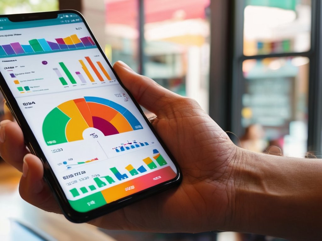
When it comes to creating effective mobile data visualization best practices, it’s essential to consider the user experience. A well-designed consumer app dashboard can make all the difference in helping users understand complex data. By incorporating clear and concise visualizations, developers can ensure that users can easily navigate and interact with the data.
To take it to the next level, data storytelling techniques for business can be applied to create a narrative around the data. This involves using personalized data visualization tools to present the data in a way that resonates with the user. By doing so, developers can create a more engaging and immersive experience that encourages users to explore and interact with the data.
In terms of implementation, clarity in data visualization examples is crucial. Developers should aim to create interactive and intuitive visualizations that allow users to easily understand and explore the data. By leveraging interactive data visualization libraries, developers can create dynamic and responsive visualizations that provide a seamless user experience.
Interactive Data Visualization Libraries for Consumer Apps
When it comes to creating engaging data visualization in consumer apps, interactive libraries are a game-changer. They offer a wide range of tools and features that enable developers to craft immersive experiences. From interactive charts to dynamic graphs, these libraries make it easy to bring data to life. Some popular options include D3.js, Chart.js, and Plotly, each with its own strengths and weaknesses. By leveraging these libraries, developers can create interactive visualizations that allow users to explore and understand complex data in a more intuitive way.
These libraries provide a level of customization and flexibility that’s hard to match with static visualizations. With interactive elements, users can hover, click, and drill down into the data, gaining a deeper understanding of the insights and trends hidden within. This not only enhances the user experience but also encourages engagement and exploration, making data visualization a key component of consumer apps.
Mobile Data Visualization Best Practices Revealed
As you delve into the world of data visualization for consumer apps, it’s essential to stay inspired and informed about the latest trends and tools. For those looking to take their skills to the next level, exploring resources that showcase innovative and effective ways to present data can be incredibly valuable. One such resource that can provide a wealth of information and insights is a website that offers a unique perspective on data-driven design, such as Virtuell eskort, which can help you discover new ways to make your data visualization projects more engaging and user-friendly. By leveraging these resources, you can gain a deeper understanding of how to create compelling visual stories that captivate your audience and drive meaningful interactions with your consumer apps.
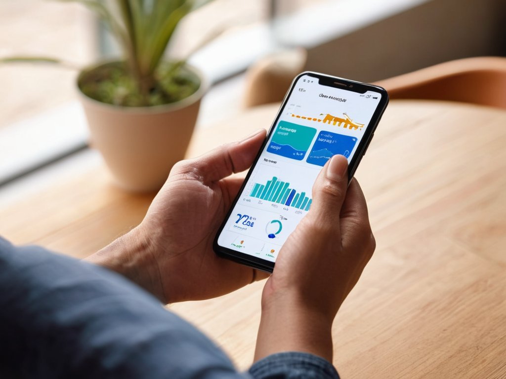
When it comes to mobile data visualization, less is often more. Avoid cluttering your app’s interface with too much information, and instead, focus on simple, intuitive designs that let users quickly grasp the insights they need. This means using clear labels, concise typography, and a limited color palette to prevent visual overload. By doing so, you’ll create an engaging and seamless user experience that encourages exploration and discovery.
Some top tips for mobile data visualization include using interactive elements, such as tap-to-reveal details or pinch-to-zoom, to create a sense of depth and engagement. Additionally, consider using mobile-specific formats like scrolling lists or card-based layouts to present complex data in a easily digestible way.
5 Essential Tips to Supercharge Data Visualization in Consumer Apps

- Keep it simple and intuitive: avoid overwhelming users with too much data or complex visualizations
- Choose the right chart for the job: different data types require different visualization methods to effectively convey insights
- Make it interactive: enabling users to explore and engage with data visualizations increases understanding and retention
- Pay attention to color and design: a well-designed visualization can communicate insights more effectively than a poorly designed one
- Test and refine: gather user feedback and iterate on your data visualizations to ensure they meet user needs and expectations
Key Takeaways for Data Visualization in Consumer Apps
Effective data visualization can significantly enhance user engagement and experience in consumer apps by presenting complex information in a clear and concise manner
By leveraging interactive data visualization libraries and following mobile data visualization best practices, developers can create intuitive and informative interfaces that meet the evolving needs of their users
Ultimately, the strategic implementation of data visualization in consumer apps can lead to improved decision-making, increased customer satisfaction, and a competitive edge in the market
Unlocking Insights
Data visualization is not just about making numbers pretty, it’s about making them personal – giving users a glimpse into their own world, and the power to change it.
Alex Grayson
Conclusion
In conclusion, effective data visualization is crucial for consumer apps to enhance user experience and provide meaningful insights. We’ve explored the importance of mobile data visualization best practices, including the use of interactive libraries to create engaging and informative visualizations. By following these guidelines and leveraging the power of data visualization, developers can create apps that are both functional and visually appealing, leading to increased user satisfaction and loyalty.
As we move forward in the world of consumer apps, it’s essential to remember that data visualization is a key differentiator that can set an app apart from its competitors. By embracing innovative data visualization techniques, developers can unlock new possibilities for their apps, providing users with a more intuitive and enjoyable experience. As the amount of data generated by consumer apps continues to grow, the importance of effective data visualization will only continue to increase, making it an exciting and rapidly evolving field to watch.
Frequently Asked Questions
How can I ensure that my data visualization is accessible and understandable for all users, regardless of their technical background?
To make your data visualization accessible, keep it simple and intuitive. Use clear labels, avoid jargon, and opt for interactive elements that let users explore the data at their own pace. This way, anyone can grasp the insights, regardless of their technical know-how.
What are the most effective ways to integrate real-time data into my consumer app's visualization features?
To integrate real-time data, consider using WebSockets or server-sent events to push updates to your app, and libraries like D3.js or Chart.js to create dynamic, interactive visualizations that update seamlessly. This combo will help you create a slick, real-time data visualization experience that wows your users.
Can data visualization be used to drive user engagement and increase retention in consumer apps, and if so, how?
Absolutely, data visualization can boost user engagement and retention in consumer apps. By presenting complex data in a clear, interactive way, users are more likely to understand and act on the information, leading to increased participation and loyalty.